
How to Prompt AI for React Native Components That Work Across iOS and Android
Table of Contents
ToggleThe problem every React Native developer knows — and how AI makes it worse if you prompt wrong
React Native promises one codebase, two platforms. Every developer who has shipped a React Native app knows the catch: iOS and Android render differently. Shadow styles behave differently. Touch feedback is different. Keyboard handling is different. Fonts render differently.
When you prompt AI to generate a React Native component without addressing these differences explicitly, you get what you would expect from a tool trained on the average of everything it has seen: a component that looks fine on whichever platform dominated the training examples and has subtle issues on the other.
The developer then spends thirty minutes fixing platform-specific bugs that should never have appeared — not because AI is bad at React Native, but because the prompt did not give it the information to handle the differences correctly.
This blog covers the specific information every React Native prompt needs, the patterns that consistently produce correct cross-platform output on the first generation, and the platform-specific pitfalls worth calling out explicitly in every prompt involving layout, touch, text, or input.
AI Integrated Digital Marketing Training
Build practical skills in SEO, Google Ads, Social Media Marketing, Analytics, Content Marketing, and AI-powered workflows through projects, live classes, internship exposure, and industry-focused learning.
What makes React Native prompting different
Prompting for React Native is more demanding than prompting for web — not because the concepts are harder, but because the output must satisfy constraints not visible in the code itself.
For a web component, a wrong output is immediately diagnosable: render it in a browser, inspect the layout, read the CSS. For a React Native component, evaluation requires running it on both a device and a simulator — because the issue might only appear on iOS, only on Android, or only on a physical device.
This asymmetry — easy to generate, hard to evaluate — is what makes prompt quality so critical for React Native. The less correct the first output, the more debugging cycles are required on a platform-specific, device-dependent testing loop that is slower than web debugging by an order of magnitude.
A prompt that produces correct cross-platform output on the first generation is worth far more in React Native than in almost any other context.
The five elements every React Native component prompt must include
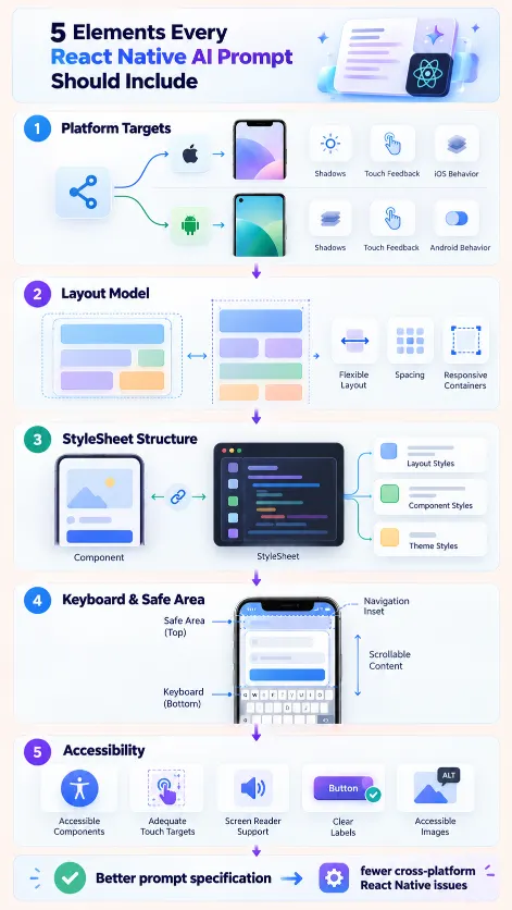
1. The platform targets and their specific handling
State the platforms you are targeting and name platform-specific behaviour explicitly — do not assume the AI will infer it:
This component must work identically on iOS 15+ and Android API 29+.
Platform-specific requirements:
- Shadow: use elevation for Android,
use shadowColor/shadowOffset/shadowOpacity/shadowRadius for iOS
(do not use elevation on iOS)
– Touch feedback: use TouchableOpacity for both platforms
(do not use TouchableNativeFeedback — the ripple behaves inconsistently
on some Android versions)
– Font rendering: use the system font via { fontFamily: Platform.OS === ‘ios’
? ‘System’ : ‘Roboto’ } for body text
This block eliminates the three most common cross-platform rendering issues in a single instruction. Include it in any prompt involving visual output.
2. The exact dimensions and flex model
React Native’s Flexbox defaults differ from web CSS. AI trained on web examples sometimes produces flex layouts that behave unexpectedly in React Native, particularly with flexGrow, flexShrink, and flexDirection. Specify layout explicitly:
Layout requirements:
- Fill container width with flex: 1 or width: '100%', not pixel widths
– Height determined by content (no fixed heights unless specifically needed)
– Root container: flexDirection: ‘column’
– Padding scale: 4, 8, 12, 16, 24, 32 (xs, sm, md, lg, xl, xxl)
– Use Dimensions.get(‘window’).width only for calculations
that genuinely require screen width, not for general layout
3. The StyleSheet requirement and style organisation
AI often generates inline style objects rather than StyleSheet.create — valid but with performance implications for frequently re-rendered components:
Style requirements:
- All styles must be defined using StyleSheet.create at the bottom of the file
– No inline style objects (no style={{ color: ‘red’ }} in JSX)
– StyleSheet keys should use camelCase descriptive names
(containerWrapper, headerTitle, actionButton, not s1, s2, s3)
– Group related styles together with a comment:
// Layout, // Typography, // Colors, // Spacing

AI Integrated Full Stack Development Training
Master HTML, CSS, JavaScript, React, Node.js, Express.js, MongoDB, REST APIs, and AI-powered development workflows through live coding, practical projects, internship opportunities, and career-focused training.
4. The keyboard and safe area handling
Keyboard handling and safe area insets are among the most common sources of platform-specific bugs — and both behave differently on iOS and Android:
If this component contains input fields:
- Wrap the root in KeyboardAvoidingView with:
behavior={Platform.OS === 'ios' ? 'padding' : 'height'}
- Use KeyboardAwareScrollView from react-native-keyboard-aware-scroll-view if the form is long enough to require scrolling
- Do not use KeyboardAvoidingView offset — it behaves unpredictably across devices
Safe area handling:
- If this is a screen component (not a reusable UI component),
wrap content in SafeAreaView from react-native-safe-area-context
- Do not use the built-in SafeAreaView from react-native —
it does not handle Android correctly
- Bottom insets are especially important:
use useSafeAreaInsets() for dynamic bottom padding near navigation elements
5. The accessibility requirements
Accessibility is frequently omitted from AI-generated React Native code, producing components that work visually but fail screen reader and accessibility audits:
Accessibility requirements:
- All interactive elements must have accessibilityLabel
(a human-readable description of the action)
- Use accessibilityRole: 'button' for touchable elements, 'image' for images, 'text' for significant text elements
- For image components with semantic meaning, add accessibilityHint
- Minimum touch target size: 44x44 points (Apple HIG) / 48x48dp (Material Design)
- ensure all touchable elements meet this requirement with minHeight/minWidth or padding rather than relying on content size
- Test with: accessibilityViewIsModal for modal components
Platform-specific component prompts
Some component types need explicit platform handling beyond the general requirements.
Modals
Generate a React Native modal component.
- iOS: Modal with transparent={true}, semi-transparent backdrop View, content centered using justifyContent: 'center'
- Android: handle hardware back button dismiss with BackHandler in useEffect
- Animation: use 'fade' (not 'slide' — behaves inconsistently on some Android versions)
- Bottom sheet patterns: use react-native-bottom-sheet, not Modal with animationType: 'slide'Lists with performance requirements
Generate a React Native list component for displaying [X] items.
- Use FlatList, not ScrollView with mapped items (ScrollView renders all items unacceptable for lists longer than ~20)
- Implement getItemLayout if all items have the same height
- keyExtractor must use the item's unique id, not the index
- initialNumToRender: 8, maxToRenderPerBatch: 4, windowSize: 5
- removeClippedSubviews: true on Android only
(causes rendering issues on iOS with certain component types)
Text inputs with platform handling
Generate a React Native text input component.
- autoCorrect and spellCheck: false for username/email/password fields
- returnKeyType: 'next' for all fields except last in form ('done' for last)
- iOS: textContentType for autofill ('username', 'password', 'emailAddress', 'oneTimeCode')
- Android: autoComplete for autofill ('username', 'password', 'email')
- keyboardType: 'email-address', 'numeric', 'phone-pad', or 'default' as appropriate
- secureTextEntry for password fields (disables autocorrect automatically)
AI Integrated React Native Mobile App Development Training
Build a job-ready mobile app development profile through practical coding, industry-style projects, AI-assisted workflows, career preparation, mentor-guided learning, real-world app deployment, API integration, and hands-on portfolio development.
Evaluating AI-generated React Native components before running them
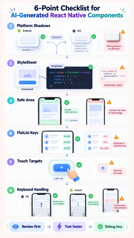
A quick code review before running the output saves significant time. Here is a six-point checklist for any AI-generated React Native component:
Check 1: are shadows applied correctly?
Look for elevation and shadow* properties. Both should be present, with elevation used on Android and shadow* on iOS — ideally wrapped in Platform.select.
Check 2: is StyleSheet.create used?
Confirm all styles are in a StyleSheet.create call, not inline objects.
Check 3: is SafeAreaView from the right library?
Check the import — it should be from react-native-safe-area-context, not react-native.
Check 4: does FlatList have a keyExtractor?
Any FlatList without a keyExtractor will produce a warning and potentially cause list re-rendering bugs.
Check 5: are touch targets large enough?
Any touchable element that is only as large as its content should have padding or minHeight/minWidth added to meet the 44pt/48dp minimum.
Check 6: does KeyboardAvoidingView use Platform.OS?
The behavior prop must be ‘padding’ on iOS and ‘height’ on Android. A single hardcoded value will break on one platform.
Running this checklist on any AI-generated component takes under two minutes. It catches the six most common cross-platform issues before a single line is run on a device.
How Learn2Earn Labs trains React Native developers to prompt correctly from day one
At Learn2Earn Labs, the React Native Mobile App Development programme builds cross-platform prompt engineering into how students work from the very first component they generate.
Students learn the five-element prompt structure — platform targets, layout model, StyleSheet requirements, keyboard and safe area handling, accessibility — as the default for every AI interaction involving a UI component. Not as a rule to follow for assessment, but as the standard they develop because they understand why each element matters.
Every component is reviewed for platform correctness — not just visual accuracy in the simulator, but behaviour on physical devices, keyboard interaction, safe area handling, and accessibility. Students who generate components with platform issues receive specific feedback on which prompt element was missing, and revise both the prompt and the component. The habit that develops — understanding which prompt elements produce which component properties — transfers to every React Native project a student works on after graduation.
Career counselling prepares students to discuss their AI-integrated component development workflow in technical interviews. As companies increasingly evaluate AI fluency alongside React Native knowledge, graduates who can articulate both have a meaningful advantage.
With alumni placed at TCS, Accenture, Cognizant, Infosys, and Nagarro, and with decades of experience shaping developer careers across India, Learn2Earn Labs produces React Native developers ready for the platform’s cross-platform demands from their first day on the job.
Visit learntoearnlabs.com or write to team@learntoearnlabs.com
Conclusion
AI generates React Native components that break on one platform not because AI is bad at React Native, but because the average component in its training data was not designed to handle all the cross-platform differences. Prompt with those differences explicitly stated — shadows, touch feedback, keyboard handling, safe area, accessibility — and you give the AI what it needs to produce correct output the first time.
The prompts in this blog are not templates to copy exactly. They are the specification of what information needs to be in every React Native prompt. Make that information part of how you think before you type, and the debugging loops shorten dramatically.
Frequently Asked Questions
1. How should I prompt AI to generate React Native components?
A good React Native AI prompt should specify the target platforms, layout behaviour, StyleSheet requirements, keyboard and safe-area handling, and accessibility requirements. Explicit instructions are important because iOS and Android can render and behave differently even when using the same React Native component.
2. Why do AI-generated React Native components sometimes break on iOS or Android?
React Native components can behave differently across platforms because shadows, touch feedback, keyboards, fonts, safe areas and other interface behaviours are not identical on iOS and Android. If these differences are not included in the prompt, AI may generate code that works well on one platform but causes problems on the other.
3. Should React Native AI prompts specify layout and Flexbox behaviour?
Yes. React Native Flexbox defaults differ from web CSS, so developers should explicitly define width, height behaviour, flex direction, spacing and responsive layout requirements. This reduces the risk of AI generating layouts based on assumptions learned from web-development examples.
4. How should AI-generated React Native components handle keyboards and safe areas?
For input-heavy screens, prompts should explicitly define keyboard behaviour for iOS and Android and specify appropriate safe-area handling. The article recommends platform-aware KeyboardAvoidingView behaviour and using SafeAreaView from react-native-safe-area-context for screen components.
5. What should developers check before running AI-generated React Native code?
Developers should review whether platform-specific shadows are handled correctly, StyleSheet.create is used, the correct SafeAreaView is imported, FlatList includes a keyExtractor, touch targets are large enough, and KeyboardAvoidingView uses platform-specific behaviour. These checks can catch common cross-platform problems before device testing begins.